The Role of Color in Food Photography
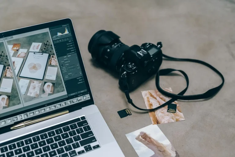
Food photography is more than just capturing a yummy meal, it’s about transmitting emotions and telling stories through visual appeal. And that is where colors come in. This article will discuss the connection between color and food photography; it will look into what is known as color psychology as well as give some practical advice on how to use colors when taking amazing photographs of food.
01. Getting to Know Color Psychology
It has been said that different colors can affect our perception, mood, or even emotion. Therefore, by choosing appropriate colors in food photography one sets the atmosphere for an image while impacting the way a viewer may see the dish. So let us uncover what these effects are and which feelings they can generate about this type of art.
1. Hot Colors: Energy and Excitement
Vibrant and energetic are hot colors such as red, orange, and yellow. Warmth, excitement, and appetite often come to mind with these shades. In food photography warm colors can create a sense of urgency or stimulate the viewer’s appetite; for instance, spicy dishes would be ideal for this effect because they are usually intense in flavor which is what red represents too so it also makes a great fit for any passionate dish. Also orange and yellow can give off feelings of warmth and comfort that are often used to show baked goods or citrus fruits.
2. Cool Colors: Calmness and Freshness
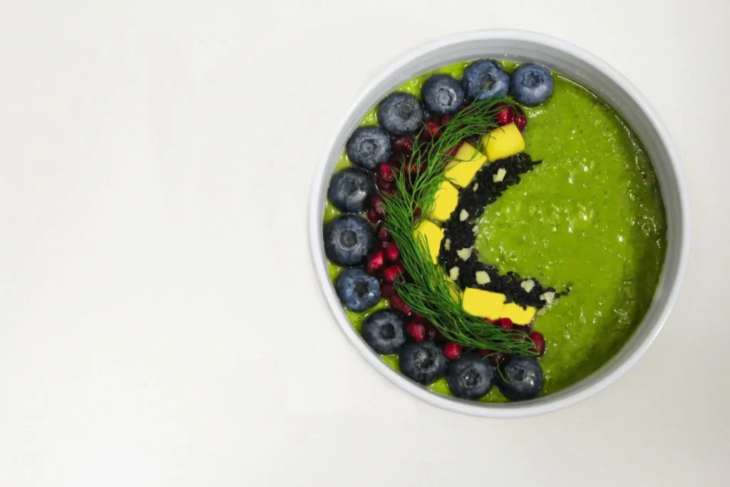
Blue, green, purple – these cool hues represent calmness, freshness, and tranquility in most people’s minds. Healthy & refreshing meals can be represented through them when taking shots of food items; Green signifies fresh natural things hence its perfect use on salads where leafy vegetables also feature while at it. Blue creates calm serene feelings which is why beverages or desserts may have some parts photographed using this shade but mainly found less frequently applied within edible materials themselves being more suitable elsewhere like packaging designs perhaps since purple represents creativity and luxury which makes sense for exotics gourmet foods too
3. Natural Colors: Uncomplicatedness and Style
White, grey, beige – these are what we call neutral colors. They can make food photography look simple and elegant. Generally, the role of these shades is to be used as a background or a prop so that the dish can shine. When it comes to creating a clean and minimalistic look, showing texture, and emphasizing details of food through such kinds of photos – white color is the most commonly used one. Moreover, adding some touches of sophistication into dishes; providing an understated backdrop for them without overshadowing any elements within those plates themselves – gray or beige may be perfect for this purpose.
02. How To Create Color Schemes For Food Photography
Now that we have explored how colors affect our minds let`s talk about making great combinations while shooting meals. A well-thought-out scheme often helps attract attention to the central element of composition thus making it visually more appealing for viewers. Here are some popular types of color schemes which can be employed in different cases:
1. Complementary Colors: Vibrant Contrast
These are opposite hues on a color wheel that create intense contrast when combined. It adds liveliness or zing to any design; including food photography. If you want to bring dynamics into your pictures try such combinations as red with green because they always catch people’s eyes. This method works especially well if you require bright salads or desserts etc.
2. Harmonious and Smooth: Analogous colors
Analogous colors sit next to one another on the color wheel, giving off a smooth and harmonious effect. This scheme is great for ensuring that all parts of an image tie together well visually. For example, mixing various hues of green with blue and teal can impart a sense of calmness and freshness ideal for healthy meals or seafood dishes. When you need something less pronounced or blended, go for analogous colors.
3. Balanced and Vibrant: Triadic Colors
Triadic colors are those evenly spaced around the color wheel which ensures balance while still being vibrant enough. This kind of combination offers contrast as well as harmony hence can work with different styles of food photography. A common triad would be red-yellow-blue where such a mix produces lively images that captivate viewers’ attention. Therefore, these types are frequently employed in bright playful food shots like desserts served at parties or other events
4. Monochrome Shades: Classy Yet Complicated
Monotone shades are derived from a single color but in different intensities to produce an attractive and refined appearance. It is ideal for showing the nature of food while avoiding many colors that may confuse the viewer. For instance, using different greens can create a consistent image which goes well with green-based meals such as salads or pesto pasta.
03. Using Color for Creating Visual Interest
Strategically, visual attention can be gained by applying color in food photography. This can be done by bringing in multiple colors that will guide the eye of the viewer thus creating an interesting composition. The following are some tricks on how to use color to create visual interest:
1. Utilize Colors as Focal Points
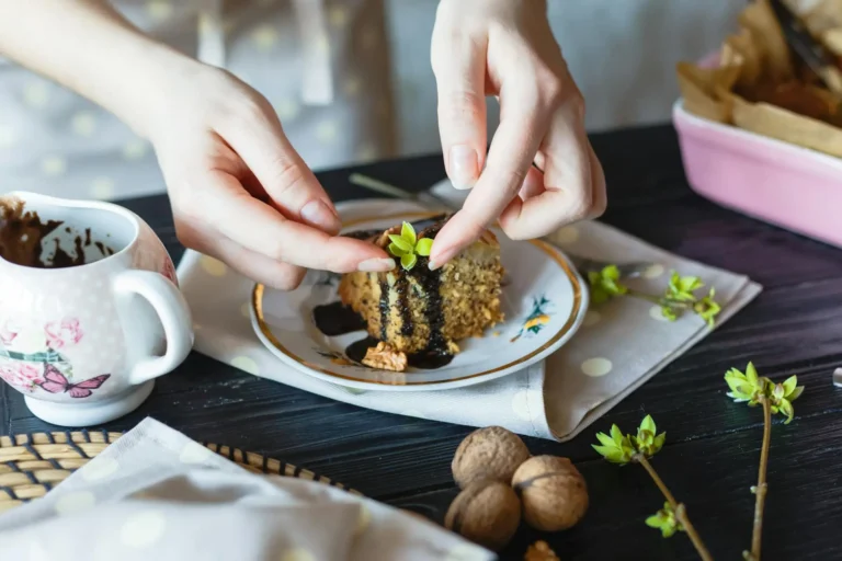
Select a bright color that will act as the center of attraction in the picture. This should be different from other parts of composition hence making it more noticeable to those looking at it. A good example is having dessert with one cherry being red and all other colors being dull around them.
2. Balance with Neutral Backgrounds
To avoid overwhelming the viewer with too many colors, balance vibrant food colors with neutral backgrounds. One way to do this is by using a white or gray background. This can help the food stand out and create a clean, minimalist look. Additionally, neutral backgrounds allow for more experimentation with different color schemes without worrying about clashing.
3. Incorporate Props with Complementary Colors
Props are an essential part of any good photograph but especially so when it comes to food photography; they help tell stories and add context. A good rule of thumb is to choose props that have colors that either complement or contrast against those found in the dish being photographed. For example, if shooting something green like a salad then consider using a red napkin for some contrast or a yellow plate for added visual interest.
4. Experiment with Color Temperature
Color temperature refers to how warm or cool a particular light source appears. In photography terms, it’s used to describe whether lighting conditions are more blueish (cool) or reddish (warm). In addition to natural sunlight, there are two main types of light commonly used by photographers: flash/strobe lighting where you have control over power output and duration as well as continuous lighting such as LED panels usually set at the specific temperatures on the Kelvin scale.
For instance, you can change up color temperature settings on your camera or in post-production editing software like Adobe Lightroom CC until achieving the desired effect – remember though that practicality should always come before style because while warm tones may look great some shots others might require cooler ones depending what mood trying to evoke from audience member looking at the image through their screen right now; there no hard fast rules about this stuff but general rule thumb would try to match up warmer tones with comfort & energy whilst cooler tones work best when trying calm people down make them feel refreshed
04. Conclusion
In food photography, color is a strong tool that can be used to create lively and attractive images that captivate the viewer’s eye. You can make your food photos more visually appealing by knowing what colors do psychologically and how to make them work together well. The crucial thing is not whether warm, cool, or neutral colors are being used but rather if a balance has been achieved to bring about harmony in the composition that will evoke intended feelings. To become skilled at using color in food photography one should introduce additional objects into the frame; also they might want to change the white balance or experiment with various color schemes altogether.